Relative Rotation Graph (RRG)
What is it ? Is it useful ? How to get started ?

Relative Rotation Graph (RRG) is a powerful tool for visualizing relative strength and momentum of multiple securities or asset classes against a benchmark. RRGs help traders and investors identify leadership trends and rotation among various market segments.
Rotation ? Wait ? What ??? We can track this ? How does something like even work ?
How RRG Works
An RRG chart consists of four quadrants that categorize securities based on their relative strength and momentum compared to a benchmark (e.g. Nifty 50). The quadrants are:
Leading (Top-Right) – Strong relative strength (RS) and positive momentum
Weakening (Top-Left) – Strong relative strength (RS) but declining momentum
Lagging (Bottom-Left) – Weak relative strength (RS) and negative momentum
Improving (Bottom-Right) – Weak relative strength (RS) but increasing momentum
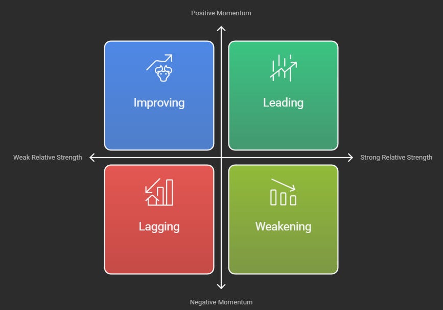
Each security moves within these quadrants in a cyclical pattern (over a time horizon), providing insights into market rotation.
Think of it this way—at any given time, some sectors will be in favor among traders and investors, while others won’t. This distribution of sectors across the four quadrants provides a clear snapshot of overall market sentiment and sector strength.
That’s enough theory for now—let’s dive in and check out an actual RRG for various sectors in the Indian markets!
(*Data considered till 2024-09-30 for educational purposes)
In case you are interested to deep dive in RRG personally for Indian Markets feel free to sign up here on Strike platform and get 20% discount on subscribing post 7-day trial period.
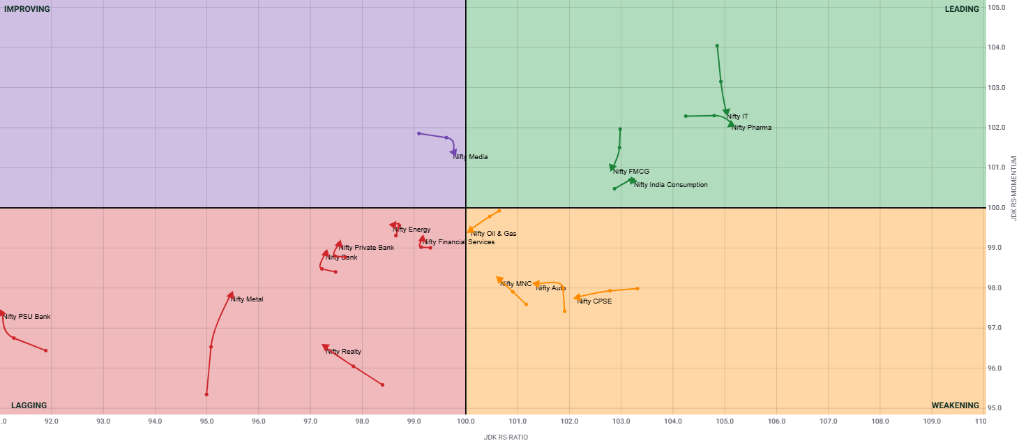
Interpretation
From Strike’s Relative Rotation Graph above (past 3 weeks trend considered w.r.t Nifty 50 as benchmark):
IT, Pharma & FMCG are in the “Leading” quadrant
FMCG although is leading, can be seen going through a loss of momentum over the past 3 weeks (notice data points joined with a line)
Nifty Media is showing signs of improvement and might enter the leading quadrant soon as per trajectory
Realty, Metal, Banks and Financial sector are in “Lagging” quadrant
However, we can notice Nifty Metal making some big strides with momentum this last couple of weeks, but at the end of the day, its still lagging and it needs more push for its overall health to improve
Impressed yet? All this insight from just one graph! Gone are the days of flipping through 10–20 different charts to gather this knowledge. Of course, diving deeper can add more granularity to research, but for those who love to study the markets and analyze them weekly, RRG is truly a game-changer.
Drop a comment below and let me know if you’d like me to cover this in more detail! RRG is a powerful addition to analytical tools, and as learners, we should embrace it and integrate it into our skillset. 🚀